
The Community Experts Team (CET) has been an exciting piece of the Tower Foundation’s funding since 2022, when this group of young people with lived experience was given decision-making power for a grant opportunity. However, since the team has been created – there has been a need for a unifying image: a logo that could distinguish it from the rest of Tower’s grants, and highlight the team’s focus on youth lived experience. When 2025 CET member, Lauren Richardi, shared pieces from her sketchbook during a local meet-up for the team on Martha’s Vineyard, Program Officer, Megan MacDavey, thought Lauren could be the one to bring the logo to life. Lauren was invited to create the logo for the CET with the help of Donna Rockwell, Art Director for Outreach and CapeCodCAN at Cotuit Center for the Arts. Together, they crafted a logo filled with symbolism that honors both the Tower Foundation and the work of the Community Experts Team.
I interviewed Lauren and Donna about their artistic backgrounds and the process of jointly creating the CET logo.
Lauren and Donna both started drawing from an early age.
Lauren shared, “I started making art when I was seven years old. I drew anything that interested me. I drew a lot of tigers at first, then famous celebrities, muppets, anything I could think of. I still decide what to draw based on what comes to mind. I’ll see something interesting and just take a picture of it and then use it as a drawing reference later. I still love drawing animals and my favorite mediums are color pencils and acrylic paint.”
With time and expertise, she has honed her craft and focused more on precision in her art, “As I got older, and as time went on and the more art I do, the more I focus on details—whether it’s shading or patterns.”
Donna’s artistic journey began with drawing too, “I was the same, I started drawing from a very, very young age. I’ve always loved and collected children’s books. I like art that goes along with storytelling or words, so I think, at my heart, I’ve always been an illustrator. Even though I’ve done a lot of fine art, I’ve always, always drawn inspiration from written word or poetry or songs, even. But, yeah, started drawing young and never stopped.”
During the interview, Lauren explained her experience of pareidolia, “It’s a visual phenomenon where some people would see a face, like the pattern of a face on an object.”
Donna excitedly related, “I’m the same! I have a collection of rocks that look like skulls. Like when I’m walking along the beach, those white rocks, I just see all these little faces and sometimes skulls along the beach.” They discovered that they had both separately connected online with others who experienced this as well, sharing experiences or photos of objects that looked like other faces. They also both tended to snap photos in nature or throughout their everyday lives, to hold onto and use as a drawing reference for later on.
Cotuit Center for the Arts is a non-profit that serves as a hub for performing and visual arts on Cape Cod, and one of Tower Foundation’s funded partners. The Cape Cod Collaborative Arts Network (CapeCodCAN) is an outreach program of Cotuit, founded in 2011 to provide inclusive arts opportunities for people with disabilities on Cape Cod and Massachusetts’ South Shore. Donna has been the Art Director for Outreach and CapeCodCAN at Cotuit for seven years, “I had a teaching background and obviously an art background. I was looking for a job that could kind of combine both and an art director position came up at Cotuit. I had been to Cotuit plenty of times and was pretty psyched because it’s a pretty awesome place. I got a part-time job there and the rest is history.”
Lauren was connected through Malissa Kenney, the founder and Director of Outreach and Inclusion of CapeCodCAN, “I knew Malissa ever since I transitioned from my high school program, so I got involved during the pandemic actually. She found out that I’m a good singer—I’ve been singing since elementary school—and invited me to become part of the open mic night on Zoom, which led me to be part of the CapeCodCAN variety shows. Then I started submitting my artwork for her Mutual Muses art exhibit at Cotuit.”
Donna elaborated, “Yeah, we were both part of Mutual Muses actually. It’s where they pair an artist with a poet. So it’s kind of like what I was talking about with illustration, where you’re inspired by someone else’s written word, and you do a piece in response. They hold it every other year, and it’s by invitation. They pick the artists and the poets. It’s a fun event.”
Lauren also got involved in the shanties event, where Cape Cod artists and artisans work and sell their handmade, hand designed or hand crafted items. Malissa invited her and some of her friends to sing at the event, “it was really good, and we got paid for it!”
I asked Lauren about whether she felt she had a distinct artistic style, “When I describe my artwork, I always focus on detail. I pay attention to different and complex patterns and shades. I look at an object…” Lauren explained as she held up a doll to show me visually, “Say if I were drawing a dress like this, I would draw the red dress but then I would focus on the wrinkles too. Sometimes I would use dark purple pencils to make the wrinkles or shadows. I feel like I’ve gradually learned to make improvements and I’m open to explore different ways and techniques. Sometimes I would use pastels to create more lighting. I’ve been drawing for years and I feel like the more I do it, the more natural and intricate and complex it is.”
Donna shared, “I definitely don’t have an artistic style. I’m all over the place. In fact, I think I sometimes get bored if I draw the same way or with the same materials. I usually choose my method based on what the project is. Sometimes it’s printmaking, sometimes it’s mixed media. Sometimes it’s a drawing. The style and medium is mostly driven by the concept. I like to jump around all over the place.
When we jumped into discussing their process for creating the CET logo, Donna expressed that Lauren took the lead.
Lauren shared,
“I wanted the logo to represent the hope of Peter & Elizabeth Tower’s legacy, what they have contributed to the community. The lighthouse came to mind because to me it represents all three primary locations that [the Tower Foundation serves]. Right next to the lighthouse, I decided to make the ocean to represent the actual beachy locations of the Cape and Eastern Massachusetts, and a sunrise to represent new beginnings. I actually looked up lighthouses in Buffalo and that’s where I found a lighthouse in between Buffalo and Niagara.”
Donna talked about helping Lauren’s vision come to life “I really wanted Lauren to kind of run with her ideas. So I think we met initially after she did some concept sketches. And we just kind of bounced back some ideas. I gave her some feedback. And then, I was there to support her graphically because I’m a graphic designer. I really wanted it to be her creation. And I would really just facilitate getting it digital and getting all the formats that are necessary for different uses. But other than that, it was more just kind of conversation, feedback. A little bit of ‘try this, try that,’ but mostly it was Lauren who came up with the compositions. I really didn’t give her any guidance on the imagery. That was all her. I acted as a sounding board and then the digital hand.”
Lauren and Donna reminisced on their early brainstorming sessions for the logo and how each of their initial concept ideas took a little revision.
Donna said, “I remember originally one of your logo concepts didn’t have anyone with disabilities and you came back in the second round and had added people with a variety of abilities in there, which I thought was awesome.”
Back in August, Lauren shared a few different logo concepts with the CET during a Zoom meeting and the team voted on their favorite one–which also happened to be the one Lauren also connected with the most.
Lauren shared her process of perfecting the sunrise in the logo, “I remember drawing the sun right next to the lighthouse. Because the sunrise is way out on the horizon and the lighthouse is, closer, away from the sun, I decided I should add darker shades because the sunrise is actually facing the opposite direction.”
Donna affirmed Lauren’s eye for detail, “that’s just a good understanding of how light hits an object, Lauren. That’s what makes you good at rendering things, because you understand light.”
Lauren carries around her sketchbook wherever she goes, and it is filled with vivid drawings. She shared some of her drawings to show how she blends colors and adds shading to render images of things she sees in everyday life. She mentioned that she is currently working on a children’s book series of her own. She is illustrating as well as writing the story. Her vision for the book series she is creating centers on a six-year old named Macy Parkington who has adventures with other kids in her neighborhood. Lauren shared four of her illustrations below.
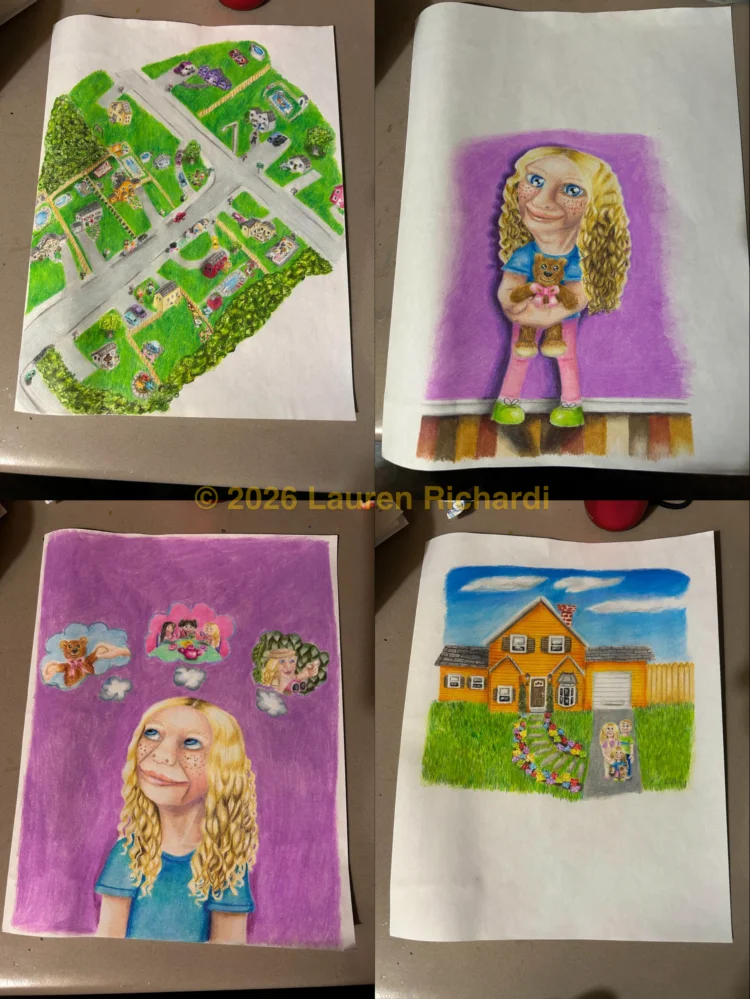
Donna remembers seeing Lauren’s sketches for the first time “I knew Lauren could draw and paint, but I had never seen her notebook before. You pulled out your notebook and I was floored, I couldn’t believe all the drawings in there and how good they were. I just hadn’t seen it all together like that.”
As we came to the end of our discussion, Lauren expressed, “I think it’s very important to show people what the logo means. [The team] is there to help people, establish organizations, and make them grow. Each organization actually brings hope and light to other people and also equity and respect and love. A lot of people want to contribute to those who need it most. And I think with my themes of hope and new beginnings and the way I showed it, it’ll highlight the story and legacy of Peter and Elizabeth Tower.”
Donna added, “a logo kind of unifies all the participants, too. You know, you all have the same image that you identify with, and it gives the group some unity. It’s kind of a shared identity. You work so closely with each other and it’s nice to have a visual representation of that shared experience.”
Lauren and Donna shared mutual appreciation for each other as we closed out, “It was a joy to work with Lauren, she’s got her natural talent, but she’s also open to ideas and discussion. She takes advice and comes up with an even better solution.”
“Thank you, Donna. You’re an incredible person and also very talented. I love how you digitalized my artwork.”
The Community Experts Team’s new logo now stands as more than a visual—it’s a reminder of what this group represents: hope, direction, and the strength that comes from shared experience. Like the collaboration behind it, the CET continues to be shaped by the people who know this work best.